

WHY SCREEN AND PRINT COLOURS CAN LOOK DIFFERENT
Your screen displays by emitting light. Printers can’t print light, they use pigments in ink to replicate colours. The process of colour matching is a skill that’s been developed over centuries, since printing was first created. Printers adjust the mix of ink colours to get the right shade. It’s why print products made by a master printer are higher quality than those made by mass-produced processes.
Getting the colours right means adjusting print’s many variables. It’s not an exact science, which is why you need experience to manage it. These variables can include:
the colour and type of paper stock chosen
whether you’re printing in digital or offset
if UV links are being used
the current calibration of the printer being used
viewing the printed product in different lights
whether a toner- or ink-based printer has been used
if the sample you gave your printer has faded over time
When you start working with a new print specialist, you may need to go through the variables with them so they can match your colours again. Occasionally, not even the most experienced printers can get an exact match. A common reason that can happen is that spot colour is the process you need to achieve a vibrant colour, but that costs more. If that happens, we talk through your options so you get the best product for your budget.
At Glide Print, all our clients receive personal service.
We take the time to explain to you what your best options are and how those choices affect the final product.
Here are a few tips to give you an overview of why print colours can look different to how they appear on your screen.
The most common reasons ARTWORK LOOKS DIFFERENT.
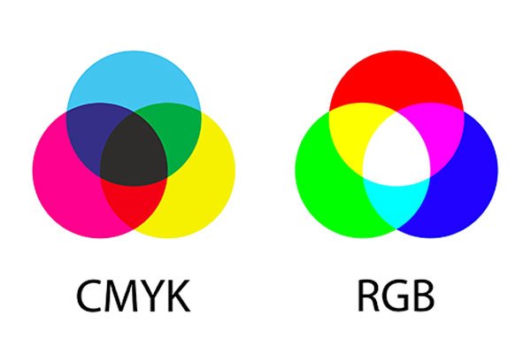
1. Computer screens show colours in RGB and print inks are in CMYK.
RGB can reproduce millions of colours where CMYK can reproduce thousands, so the range of printable shades is a lot less than what you’ll see on a screen.
You’ll see in this image that CMYK colours (cyan, magenta, yellow, black) overlap to create black and RGB colours (red, green, blue) overlap to create white.
A desktop printer changes an RGB image to a CMYK print in a pre-formatted way, but professional printing has a different process which is why you need to make sure your artwork is supplied to us in CMYK colours.
See our articles for more on getting artwork ready for print: How to Check a File Print Ready, Types of Printing Ink and Their Uses and Choosing the Right Paper.
2. Your screen is set too bright.
On a screen, you’re looking at colours that have been created by light. Having the brightness set too high gives a false impression of the brightness of the printed colour. It’s best to have your screen set to a low level of brightness when you’re creating artwork for print.

3. You need a print expert to do the colour matching.
Unless your printer has the experience and the right equipment to print specific colour shades onto the paper stock you’ve chosen, you can run into problems.
Printing is a dedicated skill that requires years to perfect. Not all printers are the same. Make sure you’re using a print expert, especially for colour matching your brand colours across your range of print products. Glide Print have access to a huge range of print equipment and only ever use skilled printers for our products.
4. You’re using the same colour matching in different print products.
Not all colours will print the same on every print material. Sometimes the printer needs to custom mix what looks like a different coloured ink so it comes out right in the print.
If you choose a printer who doesn't understand the digital printing processes of spot colour and four-colour process then the colours you see in your artwork may not print in the same shade across a range of print products such as your brochure, a heavier paper product such as a business card or presentation folder, coated and uncoated papers, and your cardboard packaging. Bright orange, for example, is a tricky colour to get right. If it’s not printed correctly, it will come out dull or even brown.


HOW TO COLOUR MATCH.
You can have a go at matching colours yourself using a Pantone Colour Bridge book or discuss what you need with us (we already have one and know how to use it).
Glide Print offer proof copies on our print products and will use that to check the colours for you. If we have one of your other print products to compare it to we can adjust the print colour so both products show the same colours. This process is used most often to colour match logos so you get consistent branding.
FIND THE RIGHT PRINTER
It takes an expert with experience and knowledge about how ink and the particular paper product you’re printing to will affect the resulting colour. At Glide Print, if you send us artwork with a colour in it that takes a printer’s skill to get right across your products, we'll let you know your options before they go to print so you know in advance how that colour is going to look, giving you time to decide it that’s the shade you’d like to use or if you’d like to create your product in a different type of paper.
Talk to us today about how you can best use colour and how to make sure your print products will reproduce them in the right shade so your key messages are expressed as powerfully as they ought to be.
We can advise you on the best options for your artwork and your product.
We'll save you the guesswork and you'll know it's going to be right.
GLIDE PRINT ARE YOUR PERSONAL print experts.
DESIGN SERVICE

The visual impact of professional quality graphic design is crucial to the success of all your marketing products.
Our designers are fast, creative and professional. We can add to your existing products or create a beautiful design from your ideas.
Glide Print supply all design work from simple tasks like getting your artwork ready for print to creating complex documents such as annual reports and marketing packages. We work closely with our clients to make sure your branding is consistent and the print quality is excellent across all your products.
All of our designers are based in Australia, we don’t outsource our work overseas. You receive personal attention from someone you can talk to and meet. It’s all part of Glide Print’s outstanding service to you.
Like all our products, we supply our design services at Glide Print’s competitive prices.
All our knowledge and skill come at no extra cost to you so you know
you're getting the best quality for your budget and the process will be an easy one for you.
We're here to help.
If you'd like to find out more about the best way to create your a-frames
call us on (08) 9221 7514 email us or request a quote.