

FONT MATTERS
‘FONTS SPEAK LOUDER THAN WORDS.’
Gus Silber, journalist
When we read, the typeface or font used causes a similar reaction in our brains to other non-verbal clues we interpret such as facial expressions and body language. The physical act of moving our eyes along the lines reminds us of the physical experiences we use to understand emotions.
In general, rounded lines make us feel happier and more at ease while angled lines are associated with negative emotions such as anger or fear but can also provoke a feeling of action. Think of how we respond to certain animals: a fluffy kitten is no threat, but the teeth and claws of a tiger will cause you to get as far away from it as you can.
Translate that to fonts and you’ll recognise how italics can be seen as light-hearted and a line full of sharp-looking capitals is seen as angry. All fonts have a personality and carry an emotional connection so it’s important to think about what you want to say and find the font that says that rather than choose a font because you like the way it looks.
Typeface appropriateness
It’s also important to understand that there’s a reaction to the connection between font and images. A harmonious relationship between the visuals and content actually improves response time and makes the text easier to understand.
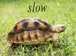
This was demonstrated in research conducted by Lewis and Walker (The Effects of Typeface on Advertising and Brand Evaluations) where they matched the word “heavy” to a heavy font and also a light one. Response time was faster for the heavy font. They found the same results when an image of a tortoise was matched to the word “slow”, and the word “fast” with participants having a quicker response time to “slow”. This harmonious pairing between typeface and word creates faster processing of the information.

How fonts are perceived
Audrey Dawn Shaikh at Wichita State University conducted three studies to determine how different onscreen typefaces are perceived. The diagram below shows the perceived effectiveness of various fonts for three different website products.
Sometimes, selecting the most obvious font isn’t the right choice. It’s not a surprise that Impact works better for the hammer ad than it does for cake, but it’s interesting that a common font such as Corbel scored the highest for that product as well as for luggage but didn’t do so well for cake.

IMAGE SOURCE: Audrey Dawn Shaikh at Wichita State University
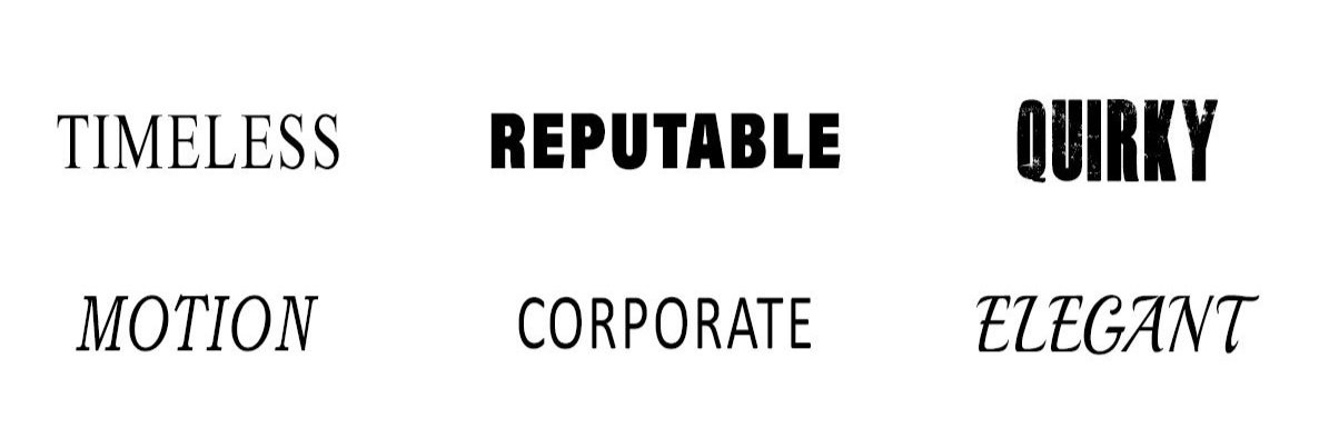
Design agency Digital Synopsis have an excellent list of font personalities and the psychology behind it in their article, What Different Types of Fonts Mean and How to Use Them. Here’s a summary of some of the emotions they attach to fonts.
If you want to be seen as…
Important
Sensible
Luxurious
Reputable
Casual
Retro
Authoratative
Sophisticated
Elegant
Try this type of font…
Slab Serif
Sans Serif
Modern Serif
Bold or Black
Script or Handwriting
Geometric or Art Deco
Condensed or Ultrathin
Monospaced
Script
Font purpose
You also need to consider the purpose of the font. For example, for a business card you need to use a font that is easy to read in a small size. It also needs to resonate with your key market and look great on the device they’ll be using. A decorative, classic style might look classy on your computer screen but it will be hard to read in a small size and is unlikely to appeal to a younger demographic. Keep the decorative fonts for material that will be seen from a distance.
If you’re creating artwork for a small item, experiment with the font’s readability by writing a line or two and reducing the size of your artwork on your screen to its actual size. If it’s nearly right but not quite, try adjusting the kerning (letter spacing) to see if that makes it easier to read.
What a font says about you
Fonts say a lot about the author too. For business documents, Calibri is a good choice because it suggests the writer is professional and stable. Other sans serif fonts such as Arial and New Century Gothic convey similar attributes. They may look conservative but they’re the right choice if you want to appear reliable and serious about what you’re saying.
Wichita University’s study showed a significant decrease in perceptions of professionalism, experience and maturity (from +1.5 to -2) as well as trustworthiness (from +1.5 to -0.5) if a decorative font such as Curlz was used instead of a sans serif such as Arial or Courier New. A writer who uses Curlz was also overwhelmingly perceived as female and an author using Arial more likely to be male.
Curious facts worth noting:
The harder a font is to read, the more the reader retains what it’s saying - but the harder it is to read, the less enjoyable the experience. Serif fonts decrease reading speed so they’re great if you want the reader to absorb more of what you’re saying but not so great if you’re presenting a lot of text.
Comic Sans can make the author appear frivolous and ill-informed about their subject - but it’s one of the easiest fonts for dyslexic people to read.
Fonts that are easy to read make us frown less.
GLIDE PRINT UNDERSTAND PRINT
and we share that knowledge with you.
DESIGN SERVICE

The visual impact of professional quality graphic design is crucial to the success of all your marketing products.
Our designers are fast, creative and professional. We can add to your existing products or create a beautiful design from your ideas.
Glide Print supply all design work from simple tasks like getting your artwork ready for print to creating complex documents such as annual reports and marketing packages. We work closely with our clients to make sure your branding is consistent and the print quality is excellent across all your products.
All of our designers are based in Australia, we don’t outsource our work overseas. You receive personal attention from someone you can talk to and meet. It’s all part of Glide Print’s outstanding service to you.
Like all our products, we supply our design services at Glide Print’s competitive prices.
All our knowledge and skill come at no extra cost to you so you know
you're getting the best quality for your budget and the process will be an easy one for you.
We're here to help.
If you'd like to find out more about the best way to create your a-frames
call us on (08) 9221 7514 email us or request a quote.