

2026 COLOURS OF THE YEAR
While Pantone went for a warm white for their Colour of the Year, other industry trendsetters were bolder in their picks to reflect a global trend towards colours that evoke imagination, nostalgia with a futuristic twist and quiet luxury.
From earthy terracotta to vibrant teal, we’ve taken a look at global leaders Pantone, WGSN and Coloro, Dulux and ISPO to see what they chose for 2026’s top colours and why.
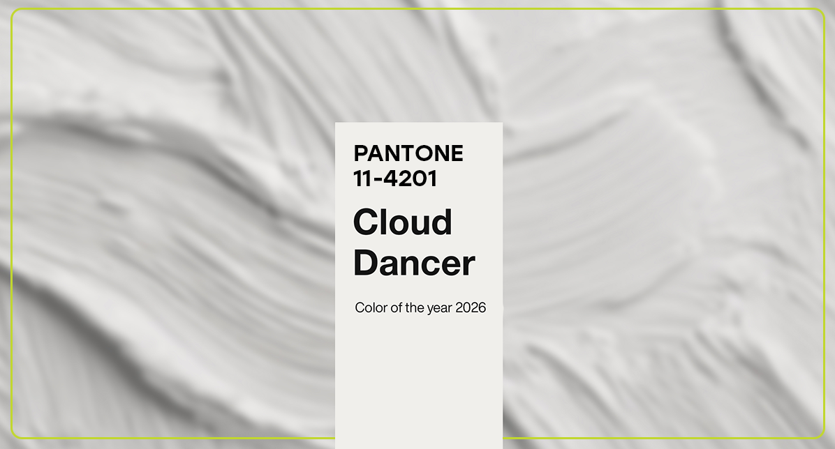
PANTONE’S CLOUD DANCER 11-4201
Billowy softness | Quiet sophistication | Relaxation and quiet focus
Pantone’s sometimes controversial choice was chosen as a harmonious backdrop that allows other colours to stand out, “bringing a feeling of airy lightness to all product applications and environments, whether making a stand-alone statement or combined with other hues”. It was a conscious decision to go for a colour that opposes black to create palettes of contrast, high visual appeal for more vibrant colours, and opportunity for unique expression.
See how to use Cloud Dancer in Pantone’s suggested palettes here.
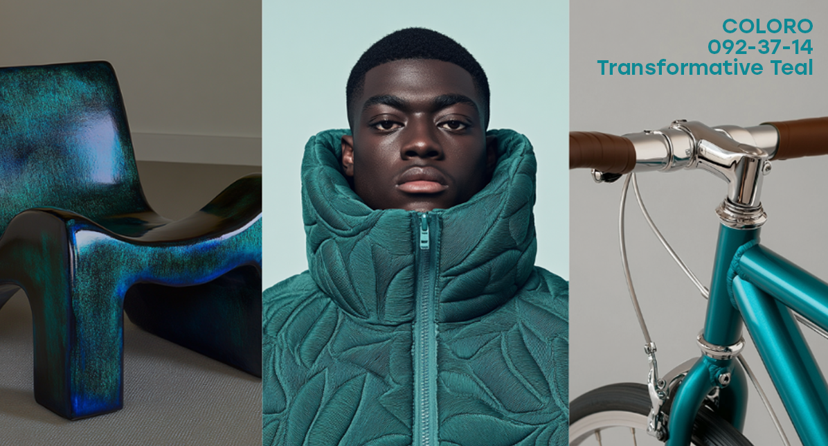
IMAGE: Coloro
WGSN AND COLORO
Freshness | Calm | Restoration
WGSN and Coloro chose this combination of aquatic green and dark blue to express consumer desire for greater ecological responsibility. Their take on what’s hot in 2026 is colours that express action towards cooperation and connection to the environment. It’s about change and redirection, resilience, and colours that are easy on the eye in our overstimulated world.
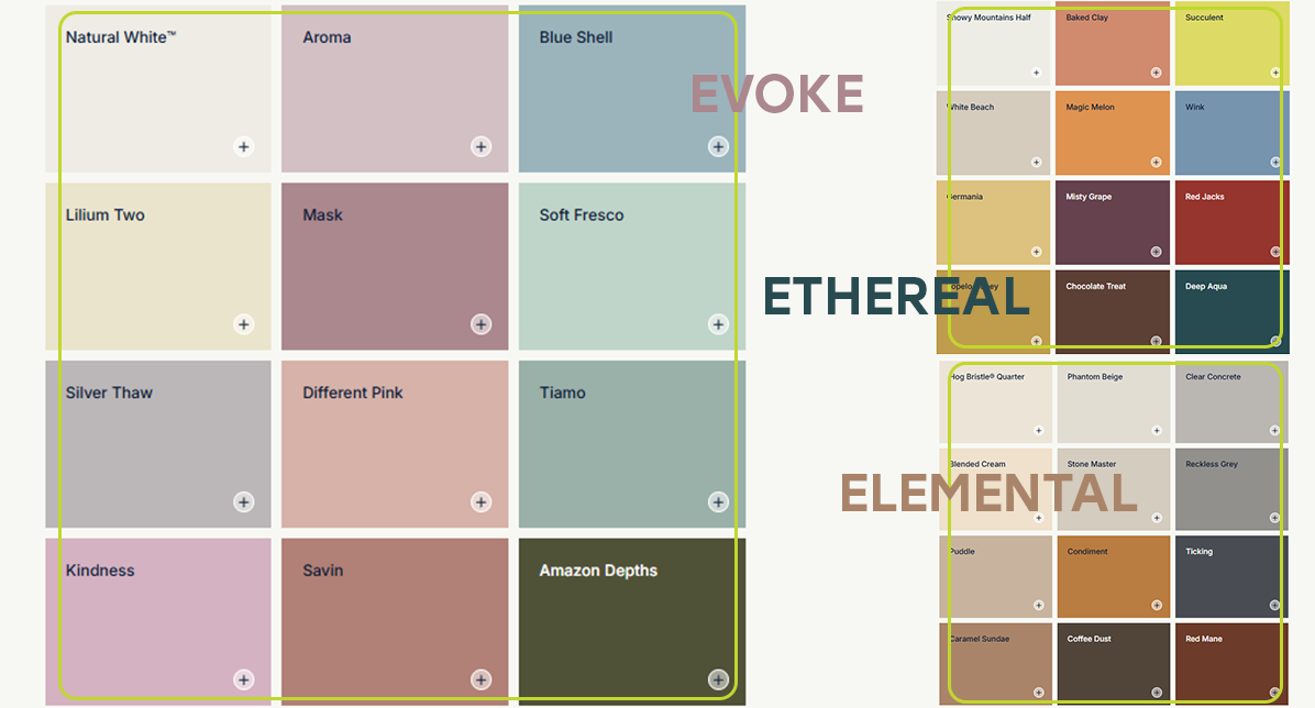
IMAGE: Dulux
DULUX
Comfort | Stillness | Quietly luxurious
Maximalism has found favour with Dulux across their three palette predictions for 2026 along with slow living and rich hues. You’ll see some old favourites in there such as Hog Bristle Quarter but also lots of thoughtful tones for a modern edge to colours of the earth.
Their Evoke Palette is all about rich tones that create “depth, character and warmth” and suggest a nod to nostalgia and imperfection. Their pick also includes a warm white and an aqua.
The Elemental Palette goes more for feelings of being earthed in tones that include neutrals, browns and stone to make you feel grounded.
The Ethereal Palette is all about old-fashioned lilacs and blues, again with a soft teal in there, that evoke romance and serenity with a touch of joy.

ISPO
Colours reflect social moods | Textile aesthetics
ISPO take a wide approach to their trend forecasts by looking at global consumer behaviour across multiple industries such as fashion, sport, technology and health. They look further ahead too. Their prediction highlights five palette concepts that will be influencing culture until peak appearance in 2027/28.
Core: Black, steel grey, and strong primary colours, industrial and powerful.
Charged: Playful, energetic tones conveying optimism.
Peripheral: Bright, luminescent contrasts enabling new combinations.
Prized: Rich, earthy shades, durable and enduring.
Resolute: Retro-inspired primaries referencing gaming culture and digital communities.
SEE ALSO 2026 Design Trends
Nothing touches like print.
DESIGN SERVICE

The visual impact of professional quality graphic design is crucial to the success of all your marketing products.
Our designers are fast, creative and professional. We can add to your existing products or create a beautiful design from your ideas.
Glide Print supply all design work from simple tasks like getting your artwork ready for print to creating complex documents such as annual reports and marketing packages. We work closely with our clients to make sure your branding is consistent and the print quality is excellent across all your products.
All of our designers are based in Australia, we don’t outsource our work overseas. You receive personal attention from someone you can talk to and meet. It’s all part of Glide Print’s outstanding service to you.
Like all our products, we supply our design services at Glide Print’s competitive prices.
All our knowledge and skill come at no extra cost to you so you know
you're getting the best quality for your budget and the process will be an easy one for you.
We're here to help.
If you'd like to know the best way to create your print products for the best price
call us on (08) 9221 7514, email us or request a quote.